Best Fonts for Short-Form Video Captions (Compared)
By Bhavya · Updated September 26, 2026 · 4 min read
The font does more to decide whether people read your captions than any animation. To make the choice easier, we rendered the same caption in all nine fonts available in CapMagic Studio and compared them on a phone-sized vertical frame. Here is what we found, and which font to pick for which kind of video.
What makes a caption font readable
- Heavy strokes. Captions sit on moving, busy footage and are read on small screens. Thin strokes break up; bold ones survive compression and small sizes.
- Simple, open letter shapes. Plain sans-serif letters are recognised at a glance. Decorative details slow reading down.
- Sensible width. Condensed fonts fit more letters per line, which helps with longer words on a narrow 9:16 frame. Wide fonts need fewer words per chunk.
- A good outline or background. No font is readable white-on-white. Pair any font with a text stroke or a pill background (see caption styling best practices).
The nine fonts compared
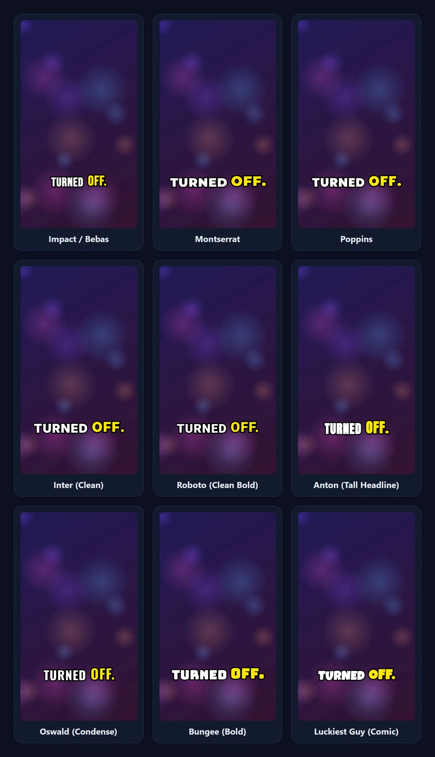
Every caption below uses the same colours, outline, size and word, so only the font changes.
| Font | Character | Best for |
|---|---|---|
| Impact / Bebas | Tall, condensed, capitals only (lowercase letters also show as capitals). | Energetic TikTok-style captions; fits long words. Used by the TikTok Viral preset. |
| Montserrat | Wide geometric sans with very heavy weights. | Reels and lifestyle content; looks clean in sentence case. Used by Reels Karaoke. |
| Poppins | Rounded geometric sans; friendly and very legible. Includes Devanagari. | Shorts, tutorials, and any Hindi or mixed Hindi-English captions. Used by YouTube Shorts. |
| Inter | Neutral interface font designed for screens. | Explainers, interviews and professional content. Used by Minimal Dark. |
| Roboto | Familiar, neutral and compact. | Straightforward subtitles that should not draw attention. |
| Anton | Very bold, condensed headline font. | Punchy hooks and short phrases; an alternative to Impact. |
| Oswald | Condensed, a little lighter than Anton. | News-style captions and longer lines that still need to fit. |
| Bungee | Blocky signage-style display font. | Gaming, tech and bold branding. Used by Neon Cyber. |
| Luckiest Guy | Rounded comic-book style. | Playful, funny or kids-oriented content; keep chunks short. |
Quick picks by type of video
- Talking-head TikTok or Reel: Impact / Bebas or Anton, UPPERCASE, 3 words at a time, yellow highlight.
- Tutorial or explainer: Poppins or Inter, sentence case, 4 words or a full sentence, subtle Highlight Box.
- Interview or podcast clip: Inter or Roboto with a dark pill background, full sentences so viewers can follow two voices.
- Comedy or reaction: Luckiest Guy or Bungee, 1 to 2 words at a time, Scale Pop.
- Hindi or mixed Hindi-English: Poppins, since it is the font in the list that includes Devanagari letters.
Size, weight and UPPERCASE
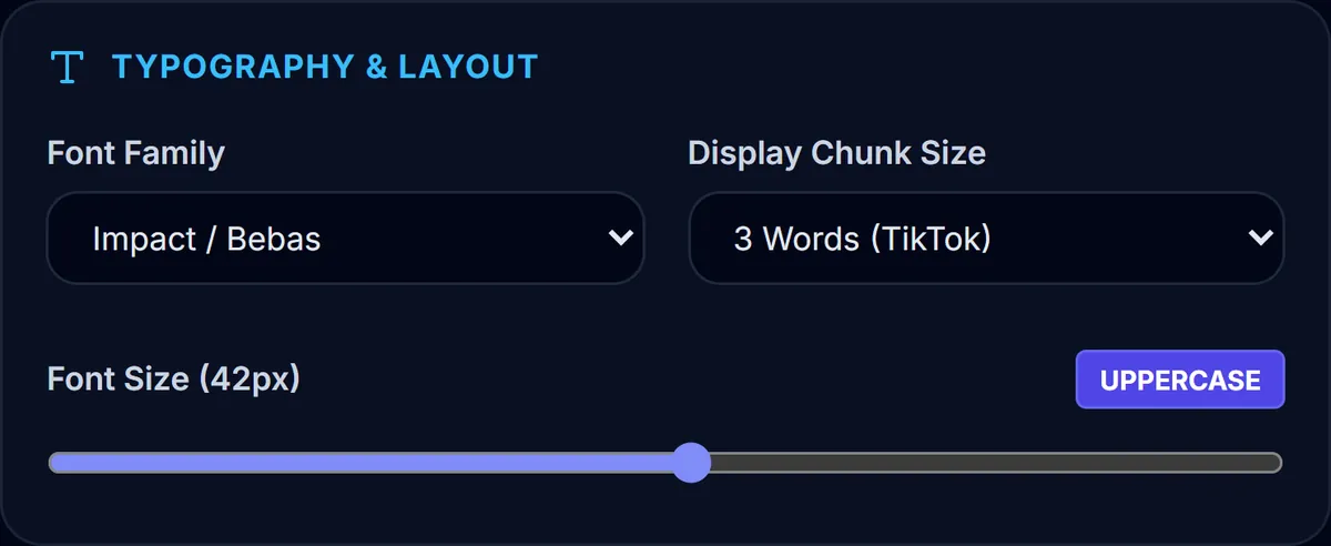
Font size in CapMagic runs from 18 to 64 px, measured on a 720-pixel-tall frame, so the captions scale with your video's resolution. For vertical video, 34 to 44 px is a good starting range: large enough to read at arm's length, small enough that three or four words fit on one line.
The UPPERCASE toggle suits condensed display fonts (Bebas, Anton, Oswald) and short punchy chunks. For full sentences, sentence case reads faster, because word shapes are easier to recognise than blocks of capitals.
A note on Hindi and other scripts
Most caption fonts only contain Latin letters. When a caption includes Devanagari (Hindi) text and the font doesn't support it, the browser swaps in a system font or shows empty boxes. In CapMagic Studio, Poppins includes Devanagari, so choose it for Hindi captions. See How to add Hindi captions for the full workflow.
Frequently asked questions
What font do TikTok captions use?
TikTok's own caption tool uses its brand font, but most creators burn in a bold condensed font such as Bebas Neue, Anton or Impact, or a rounded sans such as Montserrat or Poppins.
Which font is the most readable?
For long captions, Inter and Poppins; for short punchy chunks, Impact / Bebas and Anton. Readability depends as much on outline, size and chunk size as on the font.
Can I upload my own font?
Not at the moment. CapMagic Studio offers nine fonts that are bundled with the app, so your exported video looks exactly like the preview.
Why do my lowercase letters show as capitals?
Impact / Bebas (Bebas Neue) only has capital letters. Pick another font if you want lowercase.
Related tool
Caption Styles & Templates
Five ready-made caption looks for TikTok, Reels and Shorts, with the settings behind each one.
Ready to caption your video?
Free, in your browser, and your video never leaves your device.
Open CapMagic Studio →